Fostering Engagement in Technology-Mediated Stress Management: A Comparative Study of Biofeedback Designs
We investigate the effect of five representative designs, i.e., raw numbers for the numerical style, bar charts for the analytical style, waves for the illustrative style, butterfly drawings for the artistic style, and table lamps for the ambient style, on supporting user engagement during a guided stress management practice.
The prevalence of functional and affordable wearable biosensors has led to an increase in stress management applications for learning about and improving one's mental health. Previous research suggests that different types of graphical interfaces may evoke diverse user experiences with biofeedback interpretations and related interventions. In this research, we systematically investigate the effect of various biofeedback visual designs on supporting user engagement during a guided stress management practice. Specifically, we hypothesize that certain visual designs will affect user engagement and, thus, the training attention and physiological measures, due to their specific design features. Following a series of design studies, we assess five different styles of visual design and, for each style, we identify a suitable representative (i.e., raw numbers for the numerical style, bar charts for the analytical style, waves for the illustrative style, butterfly drawings for the artistic style, and table lamps for the ambient style). In a controlled within-subject experiment with 35 participants, we assess these five designs through a biofeedback-assisted stress management practice. We find that, overall, visual representation of data increases engagement and, thus, better facilitates stress management training when compared to a numerical display. The analysis through the results suggests that a certain level of abstraction in the interpretation of data encoding helps users move away from being judgmental; whereas animations and transitions augment the experience of being in the present moment.
Five example designs of biofeedback training in a guided stress management context.
These designs are (1) raw numbers, (2) bar charts, (3) waves, (4) butterfly drawings, and (5) table lamps, respectively. For each design, the upper part provides guidance view, while the lower part presents the user's real-time biofeedback display. These examples demonstrate the same record of one participant at a particular moment, where the upper part shows a stressed state while the lower part shows a calm state.
Research Questions
RQ1: How different biofeedback designs will affect user engagement during a guided stress management practice;
RQ2: Whether different biofeedback designs will affect users' attention allocations across the personal view versus demonstration view;
RQ3: Whether different biofeedback designs can affect users' physiological measures when relaxing in a guided stress management setting.
Design Development Process
The design development process of the design studies, where the blue boxes are different research activities while the green boxes are the output of such activities.
Design Decisions
The design decisions made during the design process. The leaf nodes represent the final design choices made after each criterion.
Design Details
We present all five representative designs (the left one is a static image where the upper part shows a stressed state while the lower part shows a calm state; the right one is an animated gif where the lower part keeps neutral) as below:
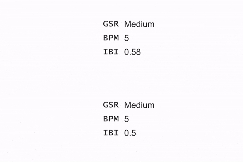
Raw numbers [video] . A numerical display of the raw data without any visual representation designs.
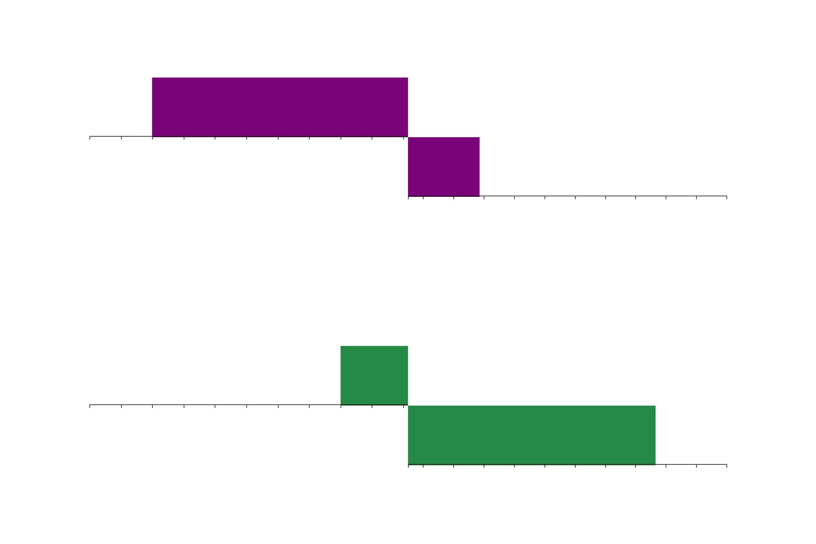
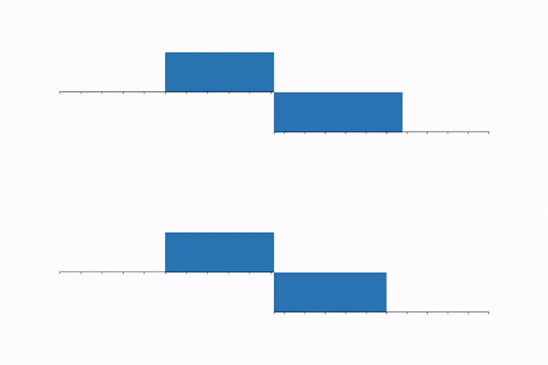
Bar charts [video] . The representative shows an overview or summary of raw data with accuracy, or statistical details derived from the raw data directly with the reference(s) or measurement(s).
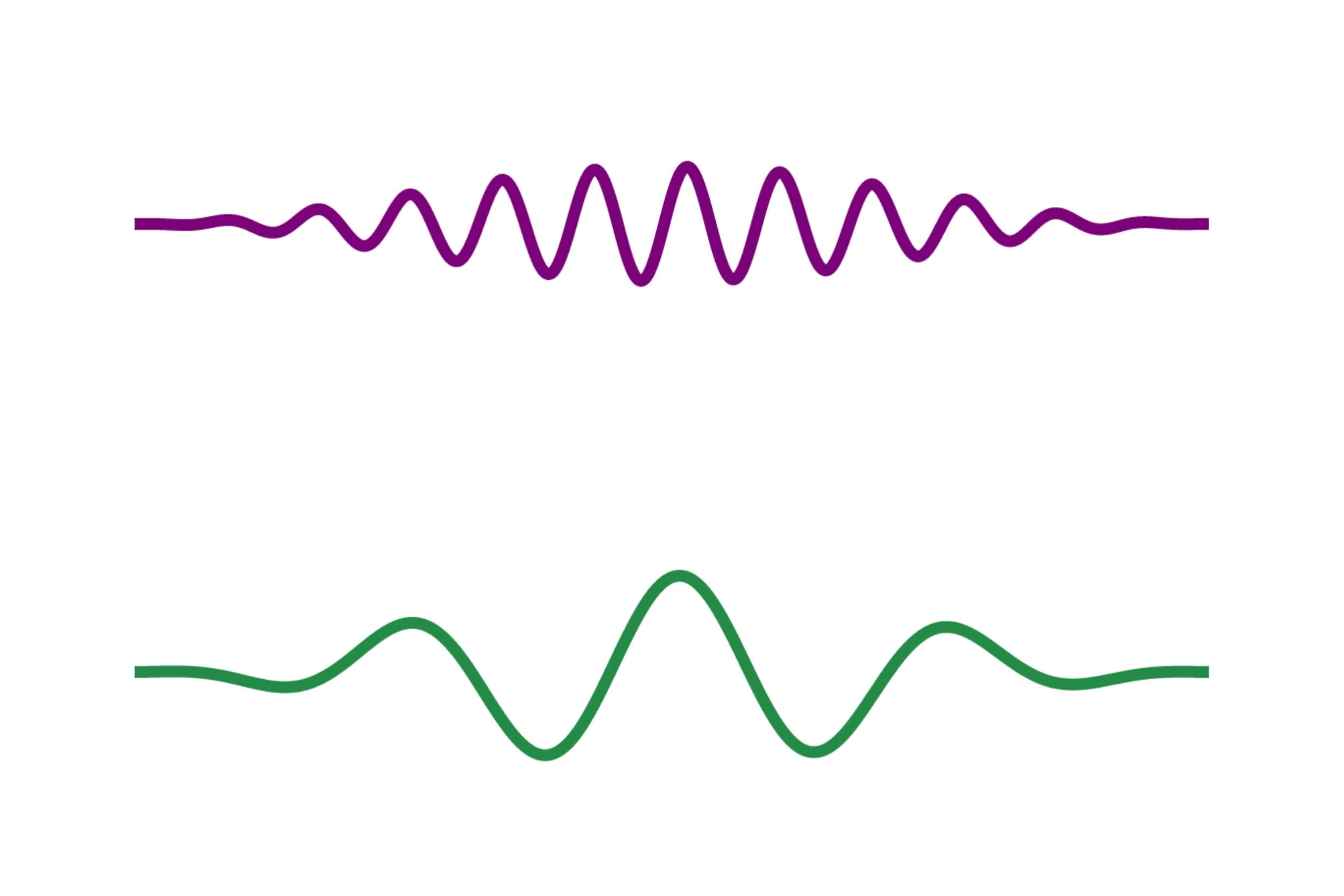
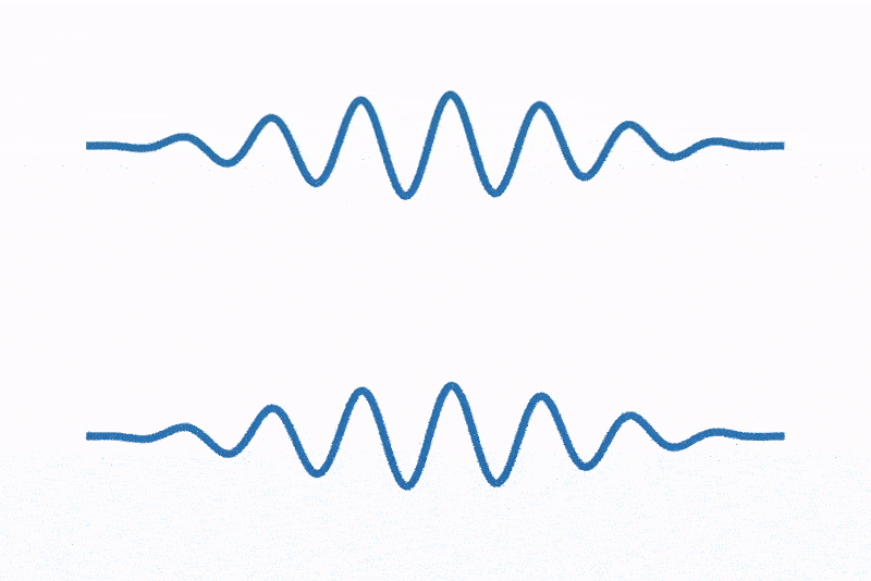
Waves [video] . The representative provides insights into the data, by implementing user-familiar visual abstraction or adopting conceptual or abstract design features that reduce cognitive effort.

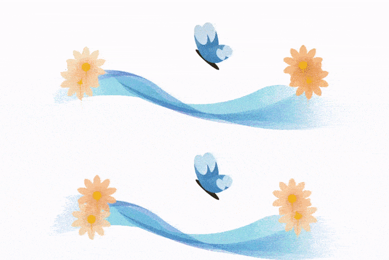
Butterfly drawings [video] . The representative emphasizes the aesthetic values that create a rich experience. The visual design should build a creative and aesthetically pleasing art form as an integrated expression of the data, which changes users' mindsets through appreciation.
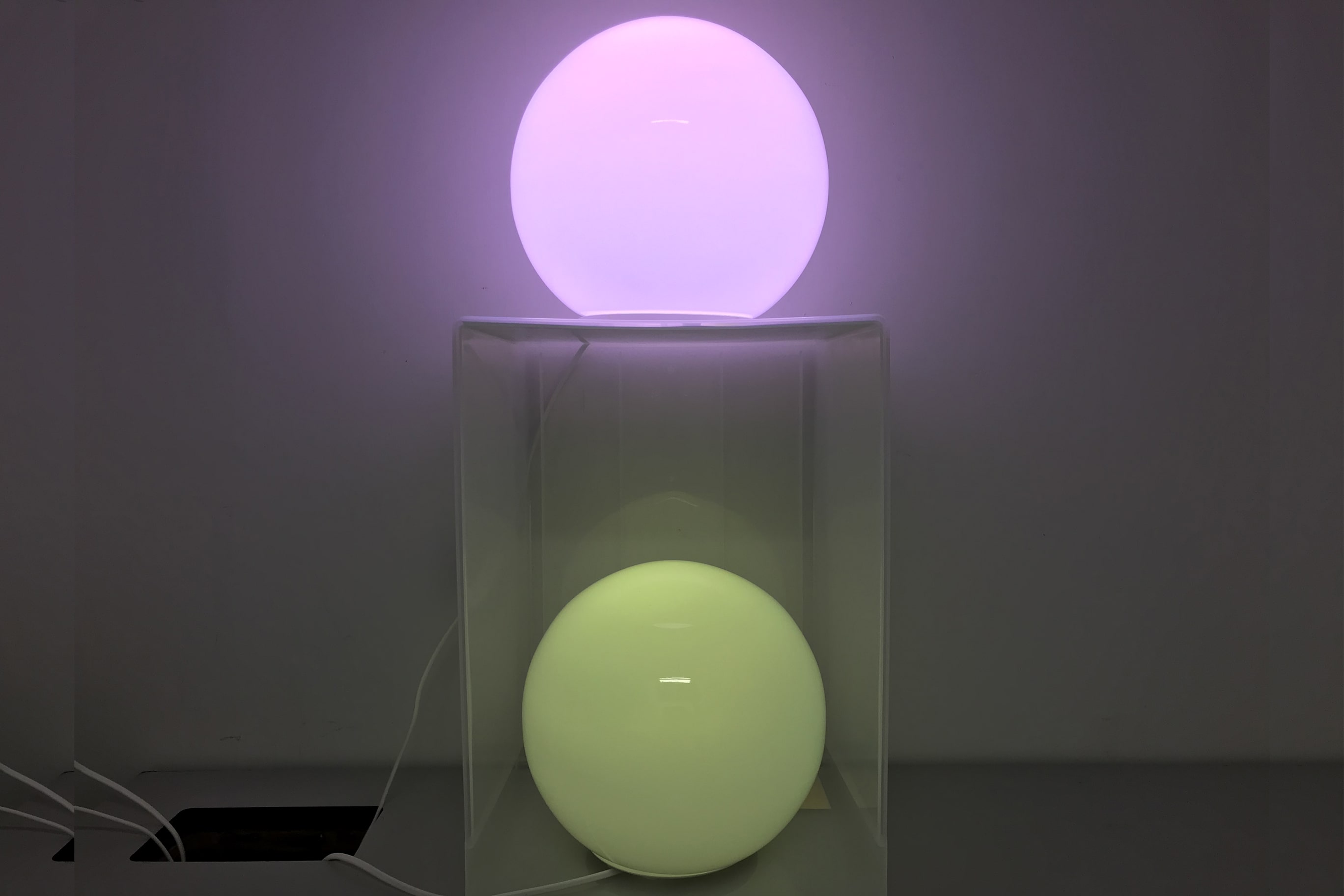
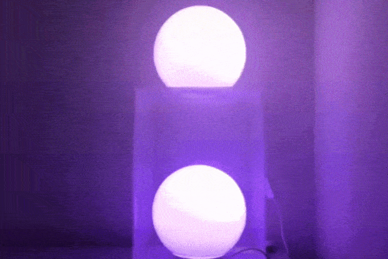
Table lamps [video] . The representative minimizes its attention efforts (e.g., can be perceived by peripheral vision) by promoting a multi-sensory and tangible representation with physical shapes.
Evaluation Methods
The lab study protocol. The design conditions are randomly assigned to each trial according to the Latin Square sequence.
Results
The results of the Friedman's ANOVA test for users' ratings collected through post-study questionnaires. MN represents the mean value for raw numbers, MC for bar charts, MW for waves, MB for butterfly drawings, and ML for table lamps. The following table also reports the degrees of freedom, chi-squared, p-values and Kendall's W values (i.e., the effect size).
| Attributes | MN | MC | MW | MB | ML | df | X2 | p | W |
|---|---|---|---|---|---|---|---|---|---|
| Perceived usability | 3.49 | 3.37 | 3.69 | 3.31 | 3.20 | 4 | 4.34 | 4.339 | .03 |
| Aesthetics | 1.97 | 2.69 | 3.57 | 4.31 | 4.17 | 4 | 86.32 | <.001 | .62 |
| Novelty | 2.49 | 2.74 | 3.46 | 4.20 | 4.23 | 4 | 63.29 | <.001 | .45 |
| Focused attention | 2.80 | 3.09 | 3.69 | 3.86 | 3.94 | 4 | 31.61 | <.001 | .23 |
| Felt involvement | 2.37 | 2.77 | 3.74 | 4.09 | 4.17 | 4 | 61.57 | <.001 | .44 |
| Endurability | 2.71 | 3.06 | 3.57 | 3.57 | 3.77 | 4 | 26.96 | <.001 | .19 |
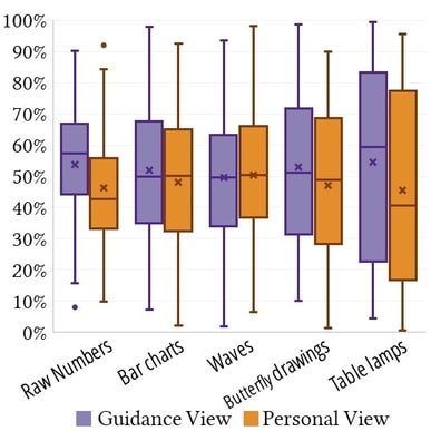
The time distribution of participants' eye-gaze data on the guidance view and the personal view.
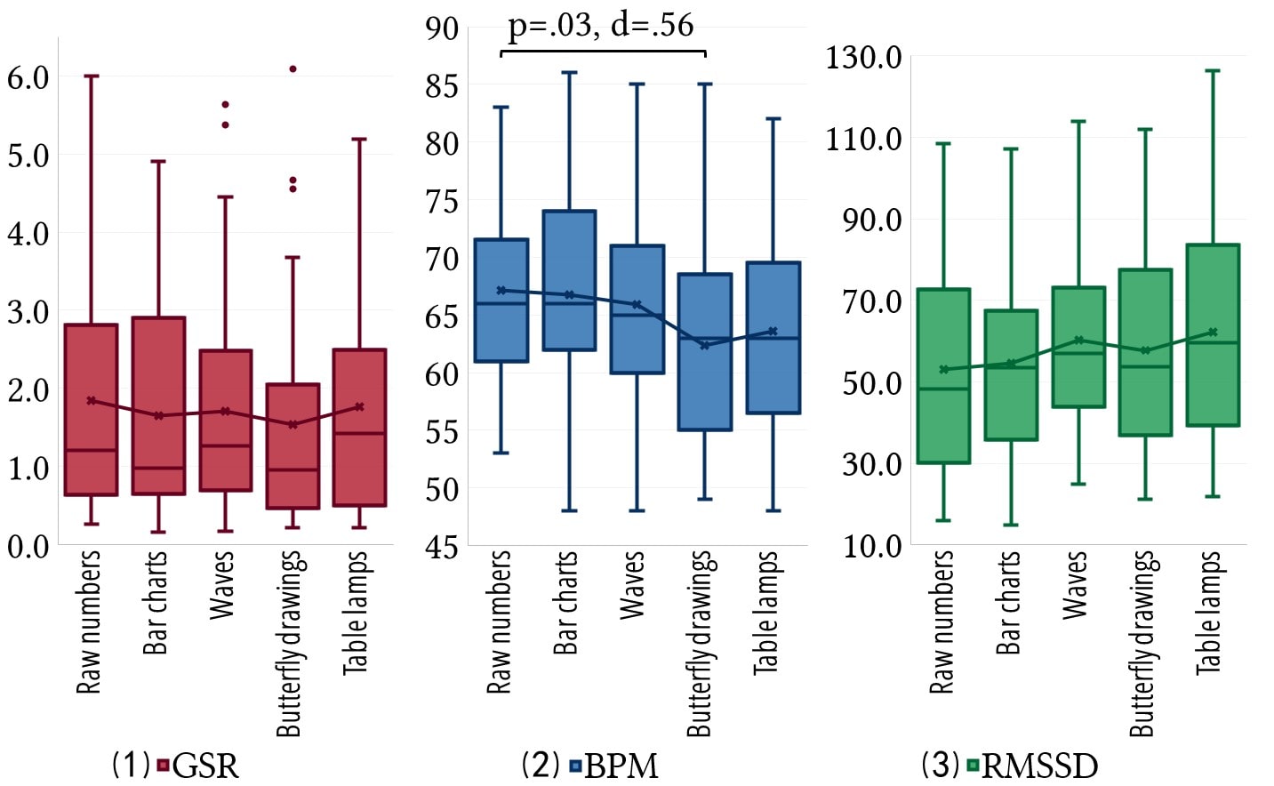
Participants' biofeedback data during the three-minute relaxation practice. (1) is the box plot of the minimum GSR value; (2) is the box plot of the minimum BPM value; and (3) is the box plot of the RMSSD value based on the IBI data.
Reflections
From the statistical results and participants' responses, we learn that each design has its own strengths and weaknesses. Without visual encodings, raw numbers provide concrete, precise details of the raw signals, but is deemed tedious. Bar charts use traditional statistical graphics. It is intuitive for users to identify a stressful moment through comparison, but its well-known usage in analytical tasks may put users in a judgmental mindset. Waves exploit direct visual analogs and present in geometric shapes. An abstract design can significantly improve the fluency of visual data processing, but striking a balance between intuitiveness and interestingness is non-trivial. Butterfly drawings leverage aesthetic metaphors to create experience-oriented visual design with the intent of making art. It is sometimes difficult to balance artistic value and communicativeness, as embellishments that are pleasing to the eyes may distract the mind. Table lamps design provides a source of relatedness and enables an immersive experience with the data. However, certain encodings (e.g., transparency, the spatial region in our case) that are commonly used in visual displays are not readily applicable to every physical display. The last three designs (i.e., waves, butterfly drawings, and table lamps) have several pitfalls. They all fail to provide precise quantitative measurements, and their visual encodings entail a learning cost.
Zhida Sun, Manuele Reani, Quan Li, Xiaojuan Ma, Fostering Engagement in Technology-Mediated Stress Management: A Comparative Study of Biofeedback Designs, International Journal of Human-Computer Studies, 2020, 102430, ISSN 1071-5819, https://doi.org/10.1016/j.ijhcs.2020.102430. (http://www.sciencedirect.com/science/article/pii/S1071581920300343)